


The Solidgate Payment Form offers exceptional adaptability and comprehensive customization options to meet diverse payment processing needs across regions. With its capability to integrate additional transaction-specific fields and control field visibility, it ensures a personalized customer experience.
Apply these options after you
Guide
Set up the Solidgate payment form with step-by-step instructions for script loading, container mounting, and payment request configuration.
initialize
the form. To change transaction parameters such as amount, product, or checkout line items on an initialized form, use
Guide
Update an initialized payment form's amount, currency, or product, or change checkout line items, discounts, and trial terms for subscriptions.
update
payment form.
Through the form, take the opportunity to:
- choose one of the four ready-made templates default, flat, card or inline
- fine-tune every element via the
stylesobject to match your brand - hide or show any optional field to streamline the checkout flow
- rename field labels and placeholders in a single place with
formParams - replace the built-in submit button and trigger payments programmatically with
form.submit()
Template

Solidgate offers several default form templates with pre-configured styles. Using a template for a payment form from Solidgate simplifies the payment acceptance process on your website.
Templates offer a pre-designed and functional form, eliminating the need for customization. This ensures compliance with industry standards for both security and customer experience.
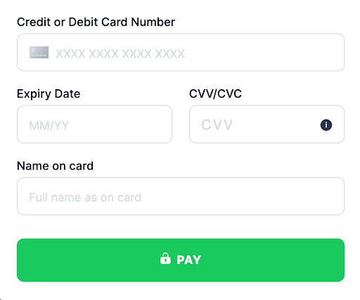
This traditional design with clearly defined input fields provides a simple, straightforward customer experience. It is ideal for businesses seeking a familiar, accessible interface without unnecessary features.
This template can easily adjust to different screen sizes, making it suitable for various devices.
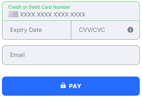
With a clean, modern aesthetic, the flat template removes shadows and textures to emphasize simplicity and minimalism.
It is ideal for businesses looking for a contemporary look that aligns with a flat design digital branding strategy.
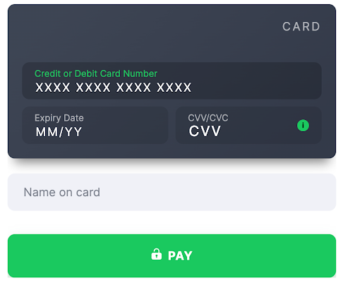
This template offers a bold, eye-catching design with depth and contrast, using shadows and highlights to create a sense of layering.
It is perfect for businesses that want to provide a dynamic and immersive customer experience, possibly for younger or tech-savvy demographics.

The inline template provides a condensed, efficient layout, ideal for quick interactions and minimal scrolling.
This is ideal for businesses wanting to simplify payment processing or embed a compact payment form within a webpage section.
Styles
Payment Form offers a styles object with nested CSS properties. This approach allows flexible styling of your website without changing HTML or JavaScript.


|
|
The properties for input fields on the Payment Form could be applied for the following states. Each state is a classname, so write it with a leading dot as the key of a nested object, for example
.error input :- .not-empty - indicates a state where the input or field is populated with a value.
- .error - represents a state where an error or validation issue has occurred.
- .valid - signifies a state where the input or field has passed validation.
- default - the initial state, which carries no state classname.
In case the state is not specified, properties are applied for all states.
Any standard CSS pseudo-class or pseudo-element can also be styled using a nested object inside a variant. Keep the CSS spelling exactly: a single colon for pseudo-classes, a double colon for pseudo-elements. Commonly used ones:
- :hover - applies when the customer hovers over an element with the mouse.
- :focus - applies when an element gains focus, such as when a customer clicks into a text input.
- :disabled - applies when an element is disabled, such as the submit button before the form is valid.
- ::placeholder - applies styles to the placeholder text within an input field.
- ::before and ::after - apply styles to the generated content of an element.
There is no support for transferring images - neither via link nor via data-uri.
For the Payment Form, applying CSS styles allows control over the visibility of form elements, providing control over the display of specific properties within the form.
|
|
Label and placeholder customization
To customize all labels on the payment form, add the parameter fieldNameLabel with the new label name in the formParams object for each desired field.
To customize all placeholders on the payment form, add the parameter fieldNamePlaceholder with the new label name in the formParams object for each desired field.
|
|
To get the value of fieldNameLabel or fieldNamePlaceholder for additional fields, you need to take the Field Class name on the table. Change it into camelcase, and add a Label or Placeholder at the end.
bolivia_ci becomes boliviaCiLabel, and argentina_dni becomes argentinaDniLabel
|
|
Custom submission
Payment Form provides two options for payment submission:
- click on the payment button
- use the
form.submitmethod
The option to display a custom payment button below the form is available, allowing for the collection of additional customer data.
To hide the payment form submit button, set the allowSubmit display property in formParams to
false
during initialization. This action not only hides the button but also blocks form submission via the enter key.
|
|
|
|
|
|
|
|
|
|
To submit the payment form without a Solidgate button, call the form submit method.
|
|
|
|
|
|
|
|
|
|
Actual submission does not occur if:
- additional fields require display due to a validation error for the new field
- some fields are awaiting validation because there are validation errors on the form
- validation errors exist in form fields, which must be resolved before the form can be submitted
Otherwise, the form is submitted.